Redesigning 600+ university course pages to increase student applications and improve user experience
A comprehensive UX redesign that increased course applications by 50% and mobile conversions by 97% during the critical Clearing period
The Challenge
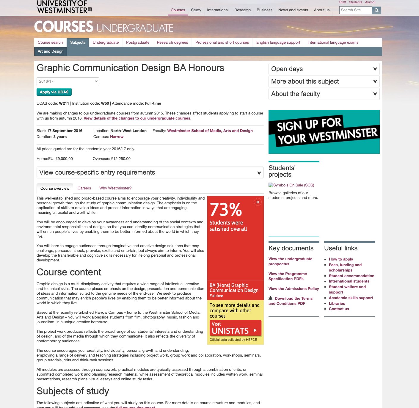
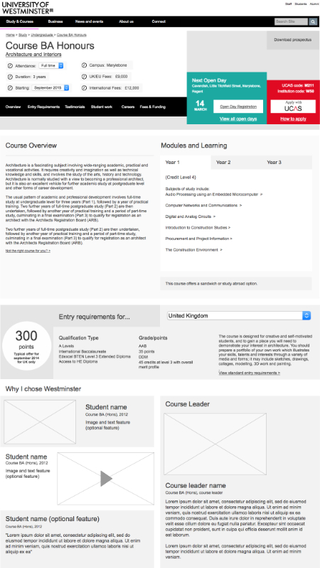
The course sign-up pages are the most important part of the University's online presence. Recruitment for courses is key to the University's success, as it is the main source of income. Each existing page looked slightly different, with no coherent template. Generally, the sign-up pages were very text-heavy and contained a lot of mandatory information required by UK Consumer Law. Course information was 'hidden' in tabs not given the prospective students the information needed to make an informed decision.
Creating a page design that balanced the needs of stakeholders was challenging. It involved marrying the needs of the academics in charge of each course and the marketing team responsible for recruiting students, while ensuring the design met the needs of the prospective students.
The Goal
Improve applications and conversions on over 600 course sign-up pages by redesigning the page layout and content. Ensure that the pages are optimized for any screen size and that prospective students can find desired information easily.
Discovery
Requirements Gathering
Gathering requirements was a lengthy process involving many teams across the organization and, for the first time, input from potential students. Along with one-on-one interviews, I ran interactive workshops where stakeholders (course leaders, heads of department and marketing) built a course page using post-it notes.
Usability Benchmarking
Performed benchmarking usability tests on our site and competitors' sites for key tasks. I enlisted the help of Periscopics, a reputable firm, to carry out the tests. This exercise allowed me to see how the University compared to its competitors and gather ideas for improving our user journey.
Industry Comparison
To identify trends in course pages across competitor universities, I compared the layout, user journey, and content quality of course pages. With this information, I identified trends in:
- Design and visual hierarchy
- Page layout and structure
- Information shown and priority
- Information architecture
- Interactive functionality
Design Process
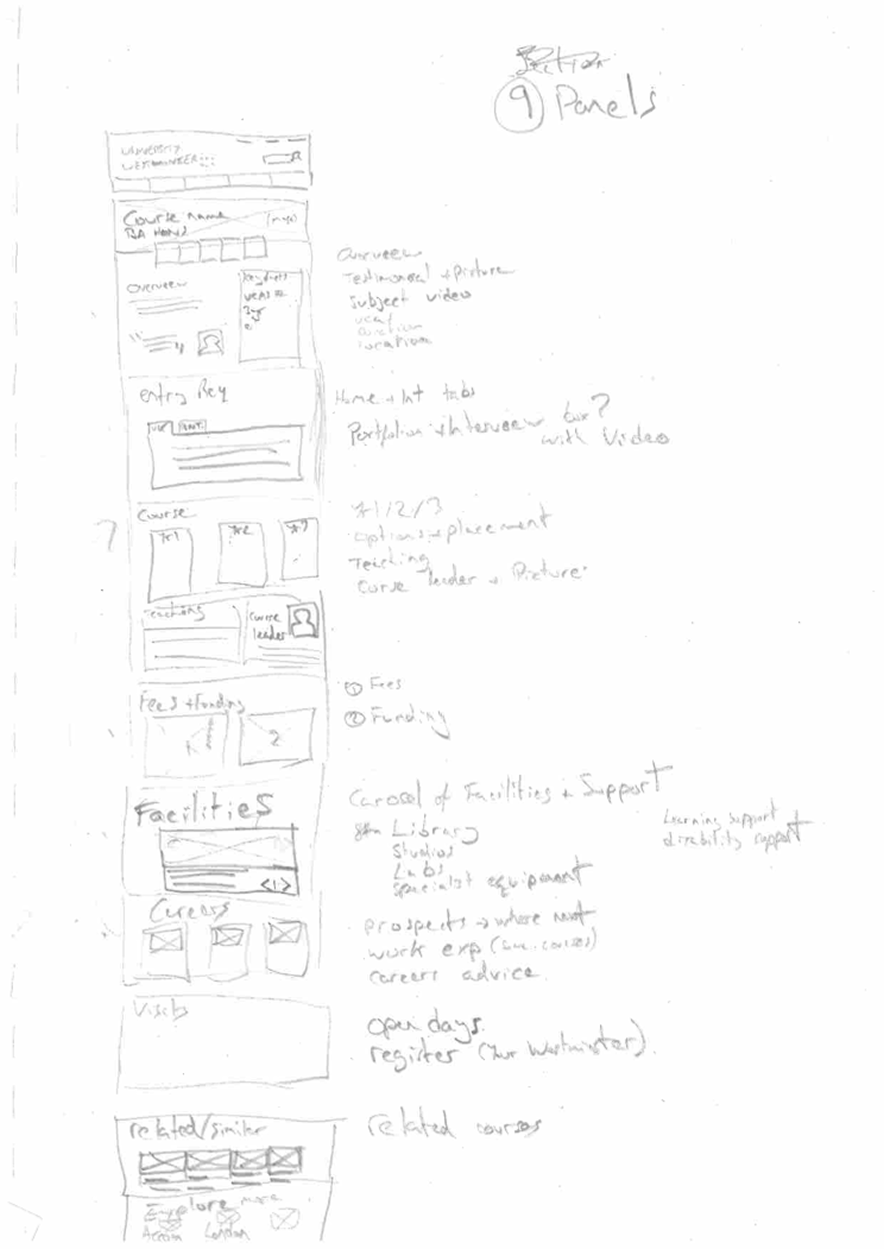
Sketches
With such a complex design, I started sketching possible layouts. This was the best way to generate many ideas quickly and flush out those the stakeholders didn't like. I concentrated on basic hierarchy, layout, and content, informed by stakeholder interviews, competitor research, and user testing.
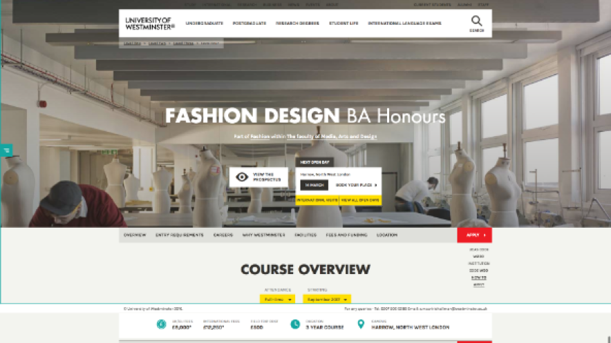
Low Fidelity Wireframes
Once stakeholders were happy with the sketches, I moved to digital wireframes using Axure RP. This step allowed me to refine the layout and start adding real content, bringing the design to life. These wireframes paved the way for user validation.
Validation & Testing
Usability Testing
Before introducing major brand elements, I validated the layout and labeling. I wrote a test containing 15 tasks based on personas developed before the redesign. I also created a script to enlist facilitators from the web team to help with testing.
To get input from real prospective students, I conducted guerrilla testing at a fair attended by 16-17 year olds. The testing focused on key tasks informed by our personas. The results were very positive, with most users completing all tasks easily. Only minor changes were needed for headings and tab design.
Focus Groups
To ensure comprehensive research, I set up a focus group with international students. This informal workshop provided insights into how international students use our website, what information they need, and the importance of each piece of information.
We used open card sorting to determine what information they needed about a course and the University, and grouped the cards by relevance and priority (MuSCoW: must, should, could, won't).
The Results
A flexible, mobile-optimized template that allows the University to market their courses to prospective students. The content has been validated to meet prospective students' needs, helping them choose a course.
The new design needed to convert prospective students during the busiest time of the year, Clearing. Conversions on full-time undergraduate course pages over the 'Clearing' period (1 July – 6 September, comparing 2016 to 2017 data) showed significant increases:
- Overall conversions up by 50% (1,499 extra clicks on apply)
- Desktop conversions up by 29% (582 extra clicks)
- Tablet conversions up by 27% (109 extra clicks)
- Mobile conversions up by 97% (883 extra clicks)
- The top ten converting course pages had a mean average increase of 72%
Overall traffic to course pages had not increased in 2017 (it dipped by about 3%), indicating that the new design significantly improved conversion rates. This was a major success for the University during a competitive time in UK higher education.
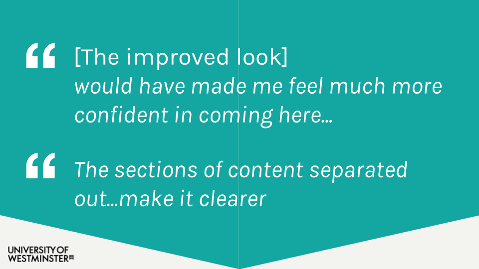
User Feedback
Even after early usability tests, I wanted to ensure the final release met user needs. I ran surveys, feedback sessions, and used Hotjar to assess the new design's impact.
The feedback from prospective and incoming students was overwhelmingly positive, with some stating that the course page was the reason they chose to apply to the University.
Note: Although the design has evolved over the years, the foundation of the work is still based on my research and initial designs.