Back to Portfolio
Redesigning the Open Days experience to increase bookings and attendance
A UX-led redesign of the Open Day listings and event pages that made location, schedule and booking clear — delivering major increases in bookings and attendance without extra traffic.
RoleUX Design, Creative Lead
Project Date2017–2018
ClientUniversity of Westminster
Outcome — quick summary
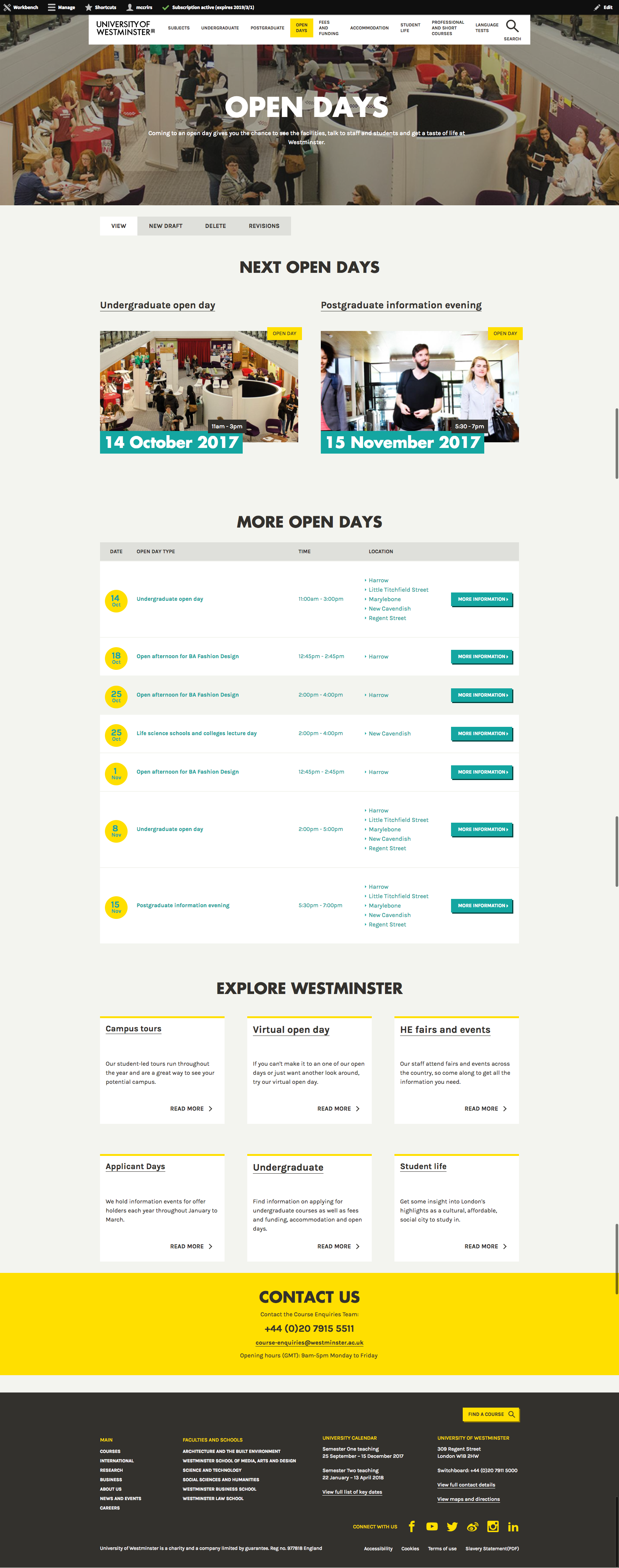
The redesign clarified event location and booking CTAs while aligning the pages with the new brand. Measured post-launch, this produced large conversion uplifts: for example, the 7 March 2018 Open Day saw a 208% increase in bookings and 63% increase in attendance versus the previous year — despite no significant traffic gain.
The Goal
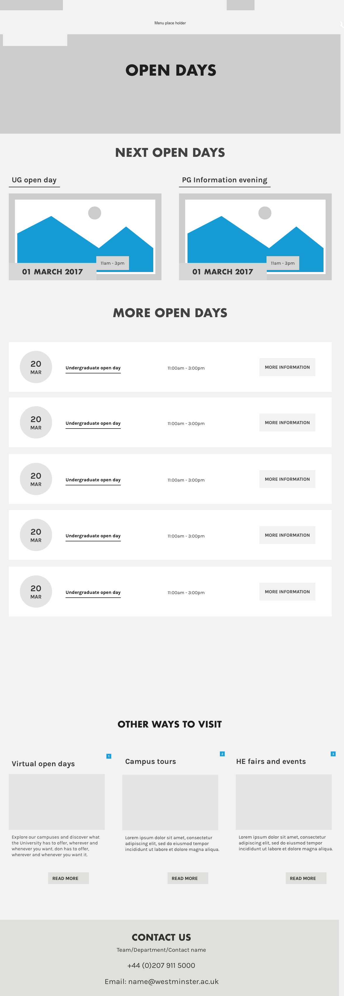
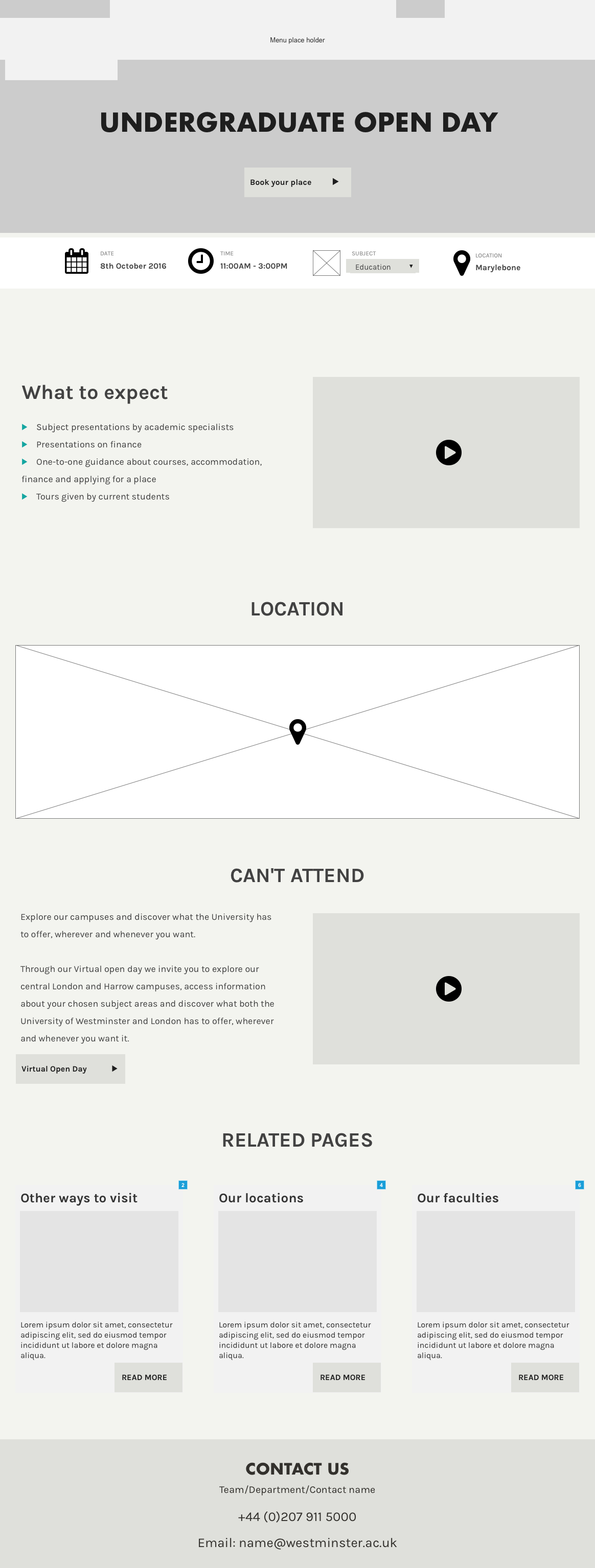
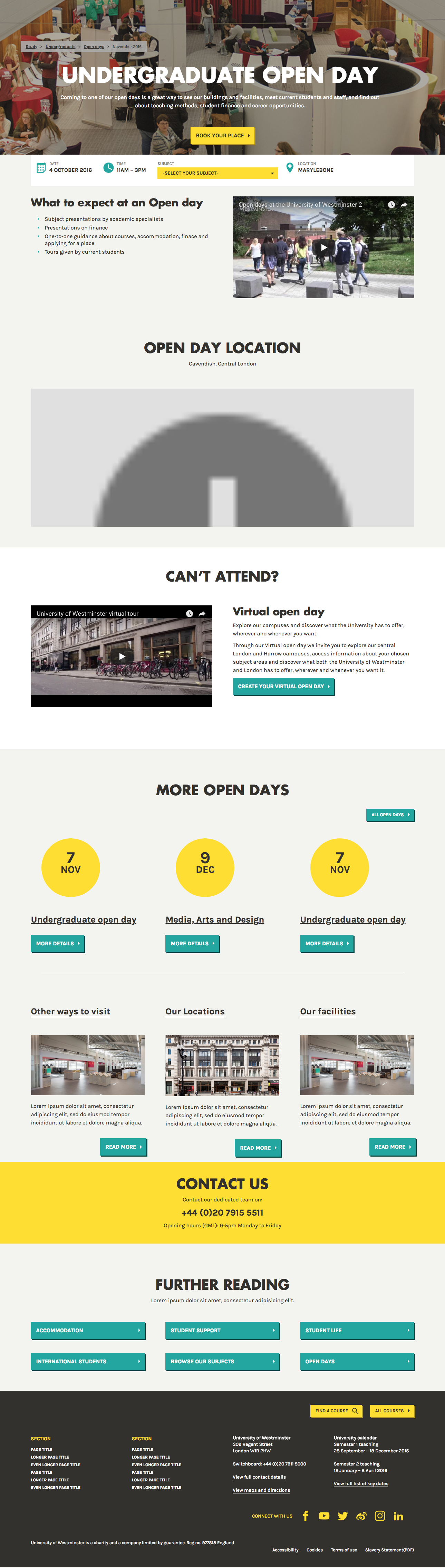
Design a clear, mobile-first Open Day listing and event page experience that increases bookings, makes location information unambiguous for multi-site events, and fits the new online identity.
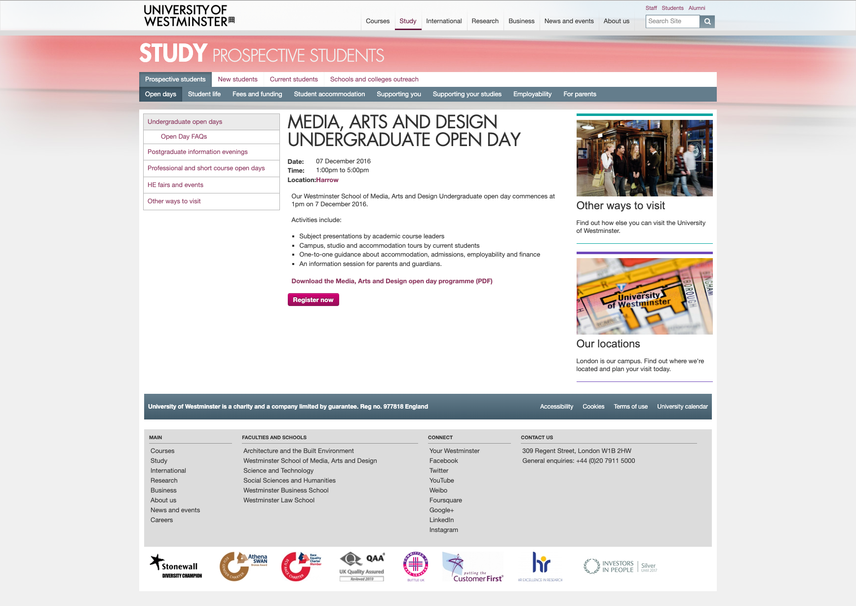
The Challenge
The organisation ran single events across multiple locations which caused user confusion. We needed new components to communicate location and schedule clearly, and to improve conversions while the booking flow itself remained external to our design scope.
My Role
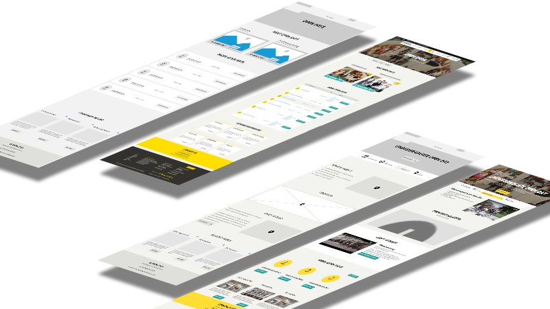
As UX Designer and creative lead in an 8-person Scrum team I led user research, design, testing, and the creation of new components incorporated into the pattern library.
Discovery
Stakeholder interviews
Interviews with recruitment, marketing and events staff clarified operational needs and surfaced the information prospective students needed most — especially around multi-campus events.
Touchpoint analysis
Mapping the entire Open Day touchpoints (discovery → booking → attendance) revealed friction with the external booking tool and opportunities to reduce confusion before users left the site to book.
Sector benchmarking
Competitive analysis helped us converge on content priorities and interaction patterns that users expect when researching and booking Open Days.
Testing & validation
Usability testing
We ran guerrilla tests with current students and incoming attendees at Open Days. Tasks were focused on locating event addresses, identifying CTAs, and confirming which campus an event applied to.
Prepared test scripts
- Detailed scripts and scenarios based on personas
- Team training for consistent, unbiased facilitation
Execution & findings
Testing highlighted unclear CTA hierarchy and gaps in location information. Iterations added explicit location components, improved headings, and simplified CTAs — all validated in follow-up testing.
The Results
A responsive, user-centred Open Days template that improved clarity and conversions. Key measured outcomes from two major undergraduate Open Days:
- 7 March 2018 — 208% increase in bookings; 63% increase in attendance (vs. 2017)
- 10 March 2018 — 71% increase in bookings; 23% increase in attendance (vs. 2017)
Because site traffic did not increase by the same margins, the improvements point to the redesign being the primary driver for higher bookings and attendance.
User feedback
After release we gathered qualitative feedback via surveys and on-site sessions — responses were strongly positive, with many students confirming the improved pages helped them find and book the right event.
Note: The designs have continued to evolve, but the core UX improvements and research-driven decisions remain the foundation of the current pages.